Thalia Caddy is the welcoming soul and light that shines behind the gorgeous brand Wild Books. Like many, she has been on a journey since the pandemic turned the world upside down and this is also true for her business and brand. Thalia threw herself into her business and gained momentum quickly. But gradually she discovered that her brand was becoming disconnected from the soul of the business and her overall vision.
The business, originally named Botany and Books, was inspired by Thalia’s passion for reading, second-hand books and handmade candles. From this, she created a book and candle subscription service and shop that supplies its customers with a mindful experience. The candles are inspired by the location of the story, transporting its readers into another world. The business provides a form of mindful escapism which the reader accesses from the comfort of their own home. With a powerful message and positive impact, Thalia came to me to help rebrand her business and create something that felt aligned and confident.
Our aim for the project was to go from having a brand that didn’t feel good enough to one that felt powerful, proud and effective. Thalia felt like her current branding didn’t do the business justice and it prevented her from putting it out into the wider world. Creating a brand that Thalia and her customers would be proud to share with the world was vital.
Changing the name
The first port of call was to work on the brand clarity. Thalia and I met to talk about the history of the business, its vision, what made it unique, what it valued and who it was for.
The business’s aim was to create escapism and connection by getting people to read more books. Its impact was inspiring and so relevant. I knew that this rebrand had a lot weighing on it. But from the beginning, I had a nagging thought. I wasn’t sure whether the name aligned with the brand.
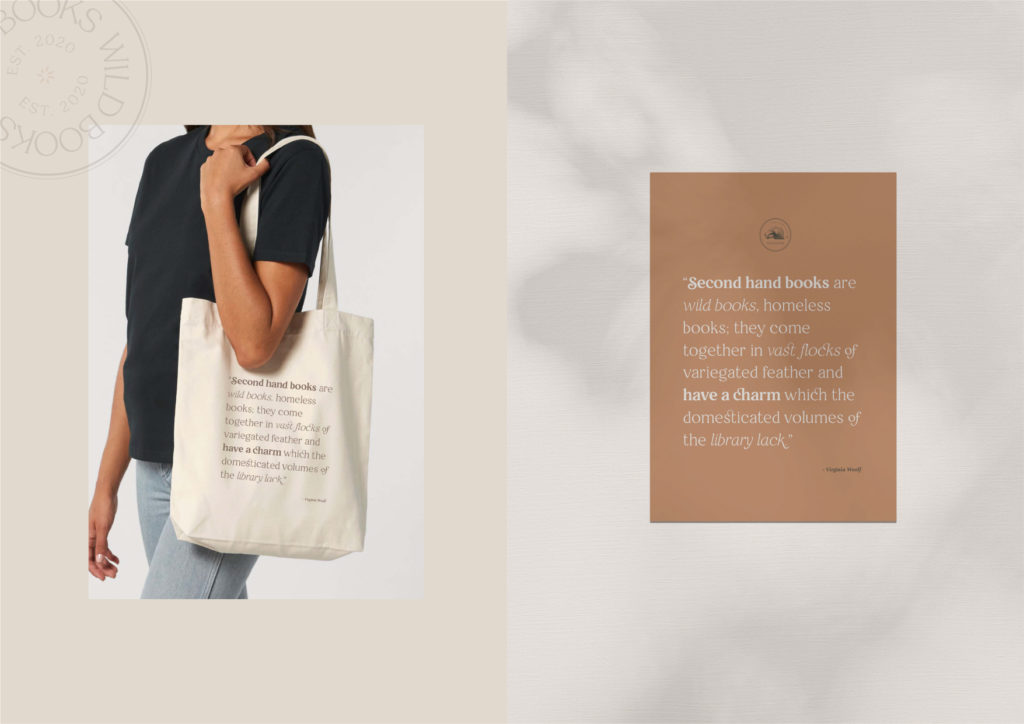
Changing a business’s name can be overwhelming, daunting and scary. But having a name of a business that is disconnected, misaligned and confusing can be detrimental for a brand. A lot of business owners can be scared of losing the work gone into an existing name, whether it be reputation, audience or search engine optimisation. I reassured Thalia changing the business name would be a challenge but one that we could turn into a positive and use to build momentum for the brand. We decided that Thalia would bring her customers and audience along for the journey of the rebrand, including the name change, emphasising the brands’ value of connection and authenticity. Thalia shared with her audience the most impactful parts of the rebrand and the reasons behind the name change, including the beautiful quote that inspired the new name.
“Second hand books are wild books, homeless books; they come together in vast flocks of variegated feather and have a charm which the domesticated volumes of the library lack.”
Virgina Woolf
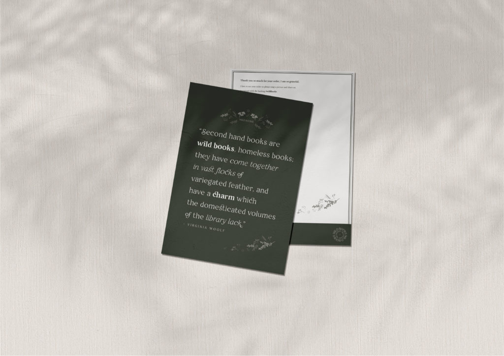
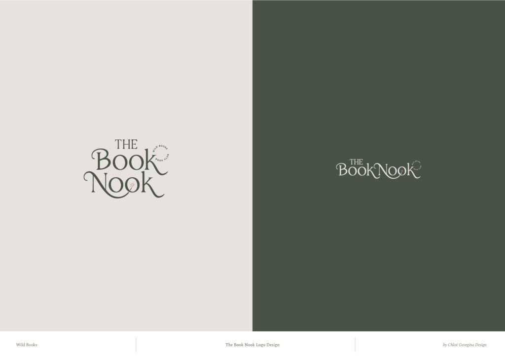
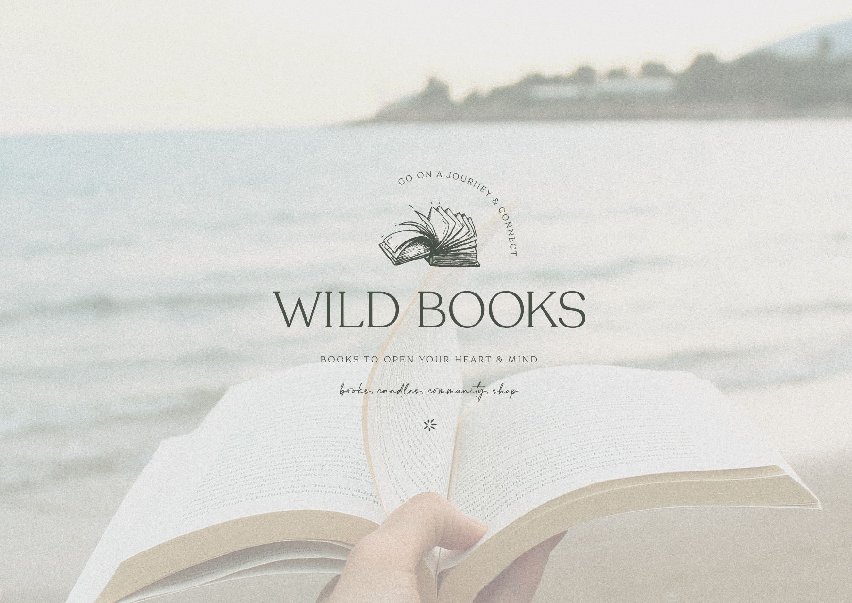
Wild Books fitted perfectly with the brand and created a feeling of connection, escapism and freedom. The decision to remove any link to candles allowed the business to expand in other areas such as membership, shop and community.
Finding the right name would not have been possible without doing all the work previously on the brand clarity. It gave direction and feeling, making the decision process quick and efficient.
We also looked at any contradictions within the brand. It’s easy to want your business to do a lot, especially when you have passion and drive, which Thalia has tons of. Together we had to decide which parts of herself she brought to the brand and which parts were separate. Refining the brand made it stronger and gave Thalia a better understanding of how she related to it.
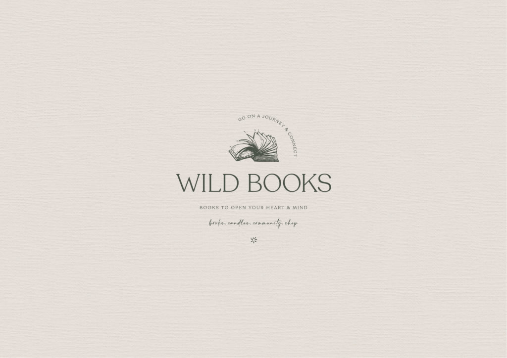
The brand design
You may have heard me speak about colour psychology and seasons before. I absolutely love applying this tool to a brand design and this particular project didn’t disappoint. We discovered that the brand sat in the summer season. This became evident from its intuitive, welcoming, mindful, empowering and patient energy. We imagined the brand comfortably sitting in the magical time of day just before the sun rises. Magic hour. The time when everything feels calm but a low level of hope is building, as we knew this brand had strength, with an underlying, grounded, wise energy.
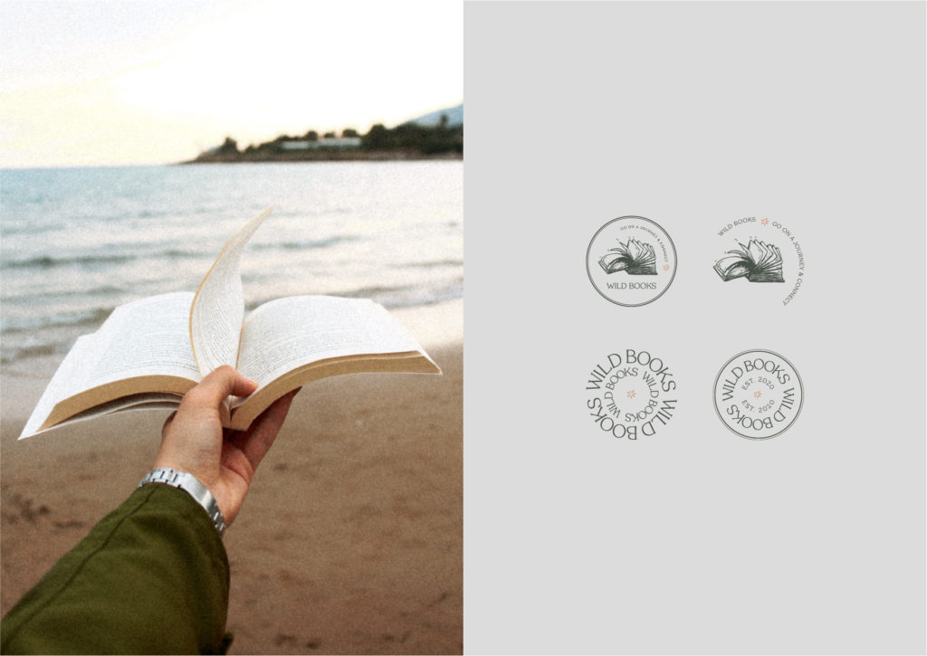
That energy was created in the brands’ book icon. The sturdiness and size of the book created a grounded, wise feeling whilst the passion and energy is shown as the pages quickly flicking past. I chose an illustration style that is detailed, distinctive and timeless. This icon became the recognisable element for the brand and represents its personality and story.
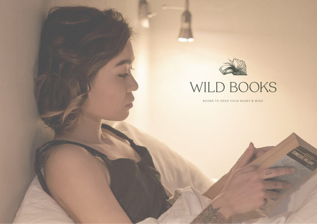
Knowing the season the brand belonged to really helped narrow down the colour choices. Summer colours have a cool, light and delicate tone. The process involved trying out many different colour combinations of subtly different colour swatches. By looking at the details in each colour and considering how each one could be used against each other I created a palette that aligned with the brand, created the right feeling and was practical. The final colour palette is timeless, quietly confident, patient, wise and empowering.
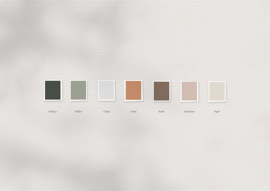
Wild Books’ brand revolves around books and words therefore we needed to find a font that celebrated that. Thalia requested a ‘hero’ font that was beautiful to look at and accessible for all. Restora became the chosen hero font because of two reasons: firstly it came with many beautiful glyphs and ligatures that could be played with and incorporated into the brand, secondly, the font worked extremely well without any extra details and still added character. Overall the font felt open, wise, mindful, and passionate. It contrasted well again the heading and body copy font choice yet still sat harmoniously with the whole brand.
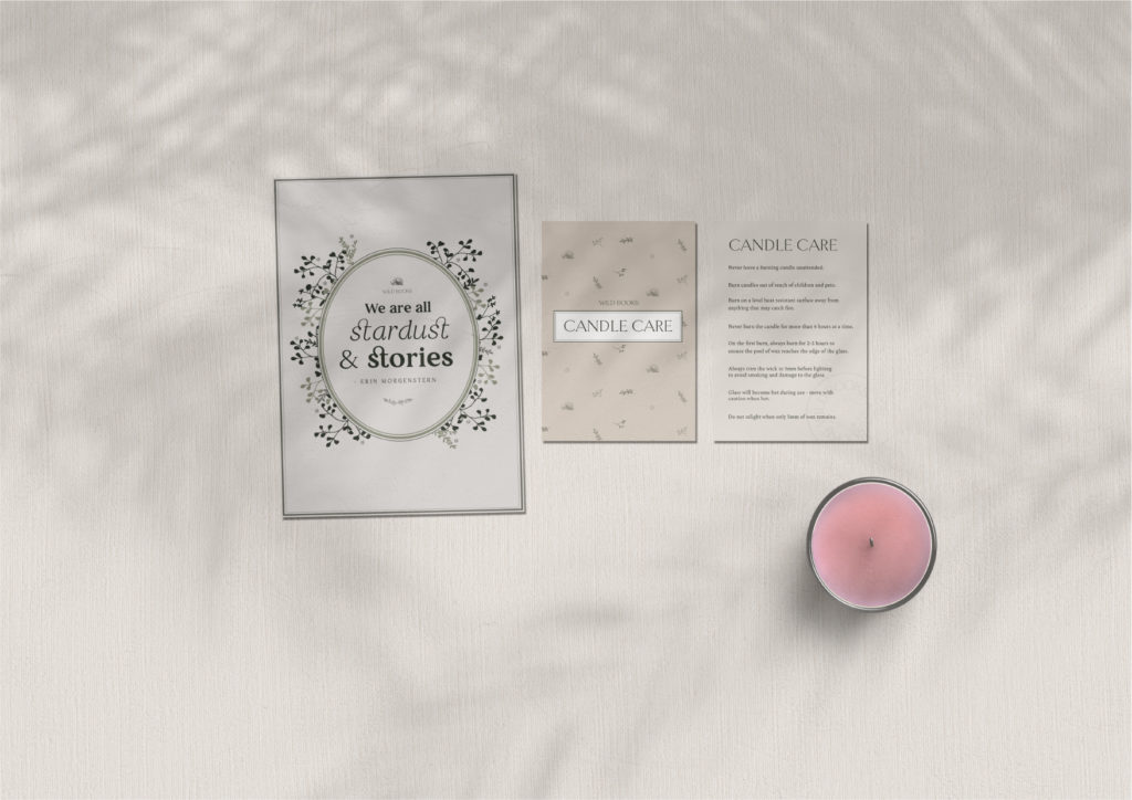
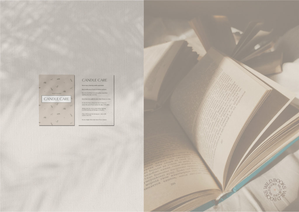
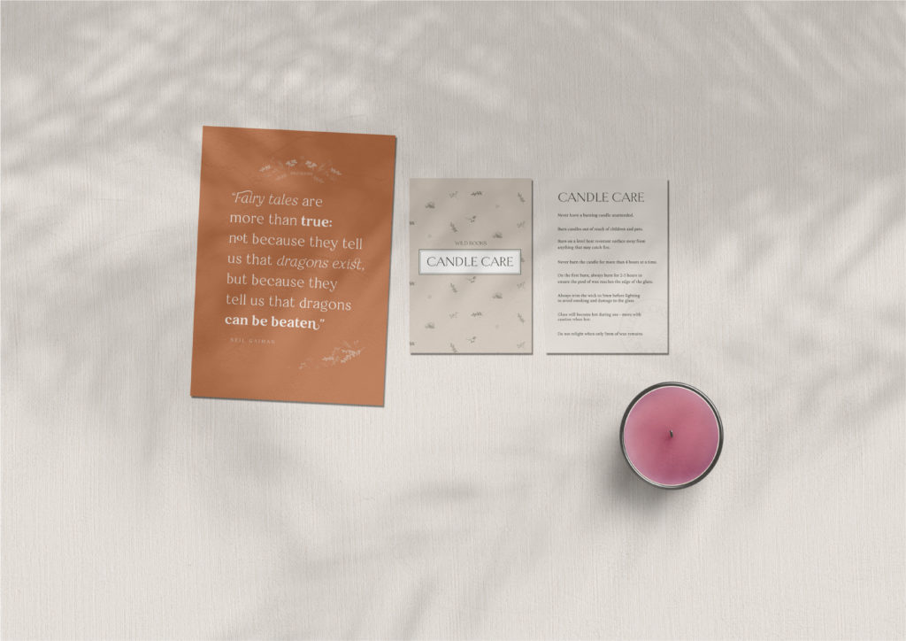
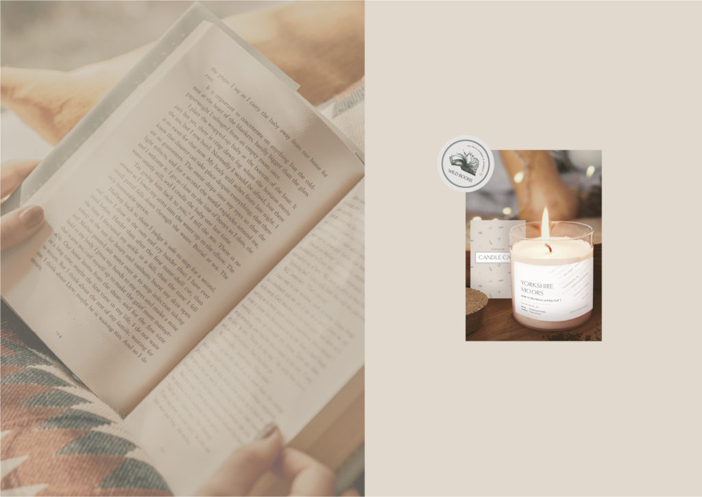
Brand design is a tool that tells a story and this was done specifically in the candle label design. The logo strapline ‘Go on a journey and connect’ inspired the designs for the candle label. A ‘ticket sticker’ was created to seal the candle. The sticker displayed important information for the user and also became a conceptual element that represented a ticket that gave them permission to take time to escape and go on their journey. The action of taking off the sticker added to the ceremonial ritual of lighting the candle. The tickets could also become collectable items for the brands’ subscribers.
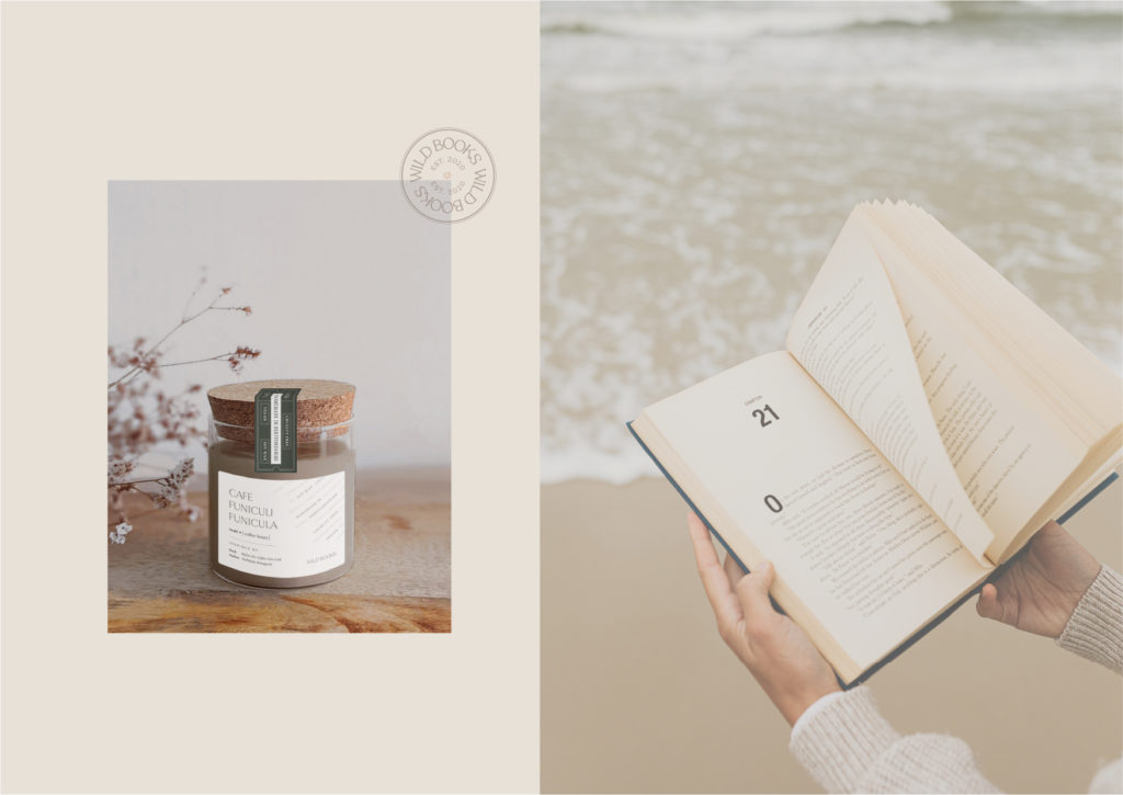
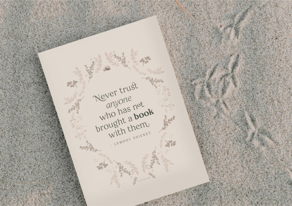
A dictionary definition layout inspired the main candle label design, framed by a subtle textured background created from quotes and phrases that link to the brand. Themes of meaning, wisdom, connection and understanding all encompass the brand experience.
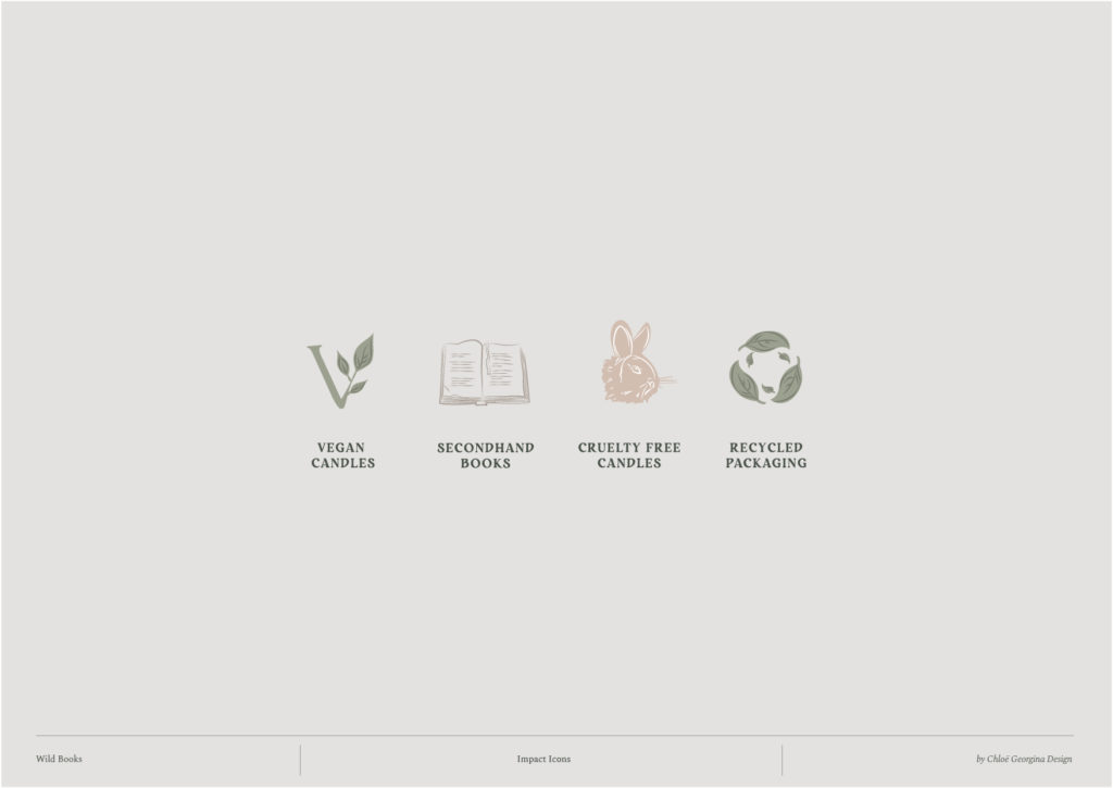
Working on Thalia’s brand was a dream project. A brand that is kind and mindful towards people and the planet in many ways. I was so grateful and honoured to support such an impactful brand during its evolution.
It was a huge transformation. From the refinement of the brand clarity, working through contradictions, to a powerful name change and the creation of a full brand design and packaging. There are so many elements to this brand design that bring inspiration and excitement.
Wild Books is a brand to watch and if you’re not already thinking of purchasing one of their products then you’re missing out. No doubt you’ll see them appearing in many retailers soon. Here are a few words from Thalia herself about the rebrand:
Before working with Chloë Georgina
“…Things felt ugly and clunky, and although I was happy to showcase my products in my corner of the internet, I didn’t feel great about putting them out into the wider world, with new wholesalers and on other selling platforms. I felt like my poor design skills were holding me back and that customers deserved better…. I didn’t feel good enough about the brand to be putting my products out into the world. And that was when I knew I needed to change the branding.”
After working with Chloë Georgina
“The design is beautiful and I fell in love with my brand again, which is mega motivating. I don’t have to try so hard to convince people the brand is a place they want to be, because it’s so easy to fall in love with.”
Have a wonderful day and I’ll catch up with you soon. x
You can get first access to any of my projects and work by signing up to my weekly newsletter Notes from the Studio. The newsletter gives you a behind the scenes view of what it’s like to run Chloë Georgina Design and I’ll let you in on any learnings I’ve had or new offerings I’ve created. Click the button below to sign up now. I’d love to have you there!
Be the first to comment