
Branding your own business is hard. It’s a much tougher task than rebranding someone else’s business mainly because you have to learn to be objective about something so close to yourself.
So when I decided to take on this challenge, to rebrand Chloë Georgina Design, I knew it was going to be an interesting journey. I knew I was going to have to get honest with myself. I knew I was going to have to give myself time to reflect and learn to be objective. Learn to not get too emotionally attached but also listen to my instincts when reviewing my work.
I had to put on the hat of the designer AND client at the same time.
But now I’m happy to say I have finally completed that journey and I am so excited to share it with you here. I’m also excited to mention that this rebrand is the result of my new process for creating a full brand design. This process has been developed and changed for the better over the past year. It’s a process that creates brands that are strategic, intentional, authentic and support the businesses they are created for with commercial success.
By putting my new process into practice, it has helped me to find authenticity and to think big. Keep reading to see how this new process had an impact on how I created the new brand design for Chloë Georgina Design.
The biggest upgrade – finding brand clarity
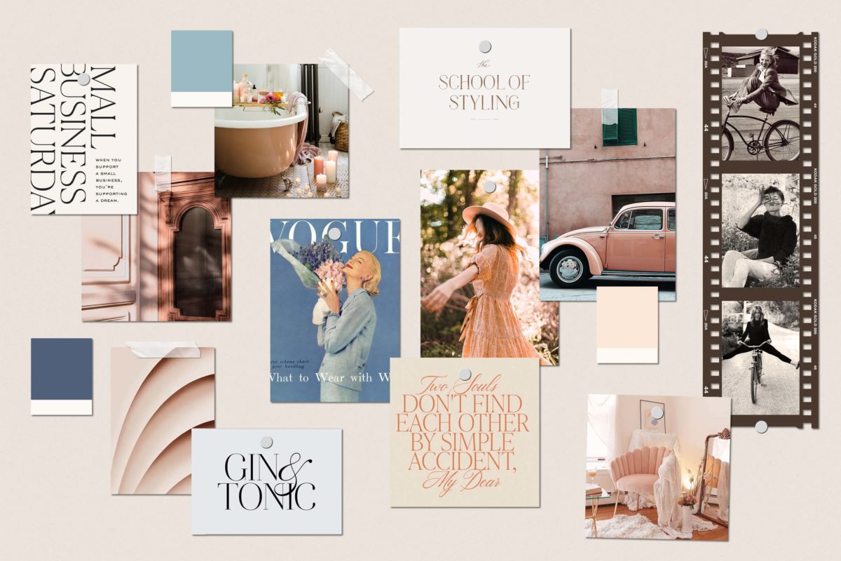
Never before have a spent so much time creating and working on moodboards, but wow, it is worth it! By creating intentional moodboards, it creates a solid, strategic foundation for a brand design.
I designed these moodboards through the ‘lens of feeling’. This lens was filtered with three key words. Those words were Timeless, Encouraging and Uplifting.
These three words came from a lot of soul searching, journaling and reflecting. Eventually, after a lot of digging deep and scrutinizing, I ended up with a group of words and phrases that when put together told a holistic story for Chloë Georgina Design AND created the right feeling.
I used these three words as a constant reminder and they became the solid pillars for the moodboards. Putting together the imagery was a continual process of questioning, editing and tweaking what was on the page. If something didn’t quite feel right I got strict with myself and got rid of it. Eventually, I was on the way to creating something that felt right and exciting. It was a process of discovery, that brought surprises from unassuming places.

Making these moodboards wouldn’t have been possible without Brand Clarity.
But what is brand clarity? Brand clarity is getting extremely clear on what your brand is by exploring a series of questions, whose answers become the building blocks for the visual inspiration for the brand design.
It’s the part of the process that I had to work on before doing any designing, you know, the soul searching bit. Rather than settling for surface-level ideas, I wanted to make sure that what I was creating felt right and had longevity. I had to feel special. It had to feel like me.
The finished logo design
I’m so pleased with the new logo for Chloë Georgina Design. I think my favourite bit is the ‘G’ in the script font and how it sits against the contemporary yet classic Gallery Modern font.
Interestingly my branding has gravitated towards using a script style font before. The reason why it still works well now is that it lends itself to that timelessness but is also uplifting. It has movement and energy which are key principles to the way I run my business.

Gallery Modern is an amazing font with some great features. However, for the purpose of the logo, I toned down the character to bring in simplicity. The thick and thin lines in the letters with the curves and sharp edges created the exact amount of strength, ambition and elegance that I was looking for.
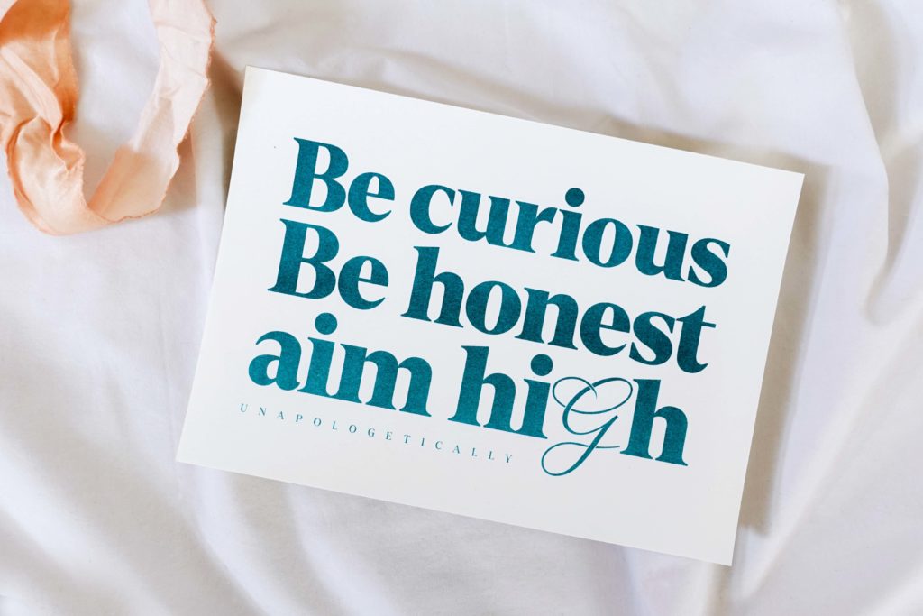
Overall I think, along with the tagline, the logo feels encouraging and timeless, subtly nudging you to aim high without being overwhelming.

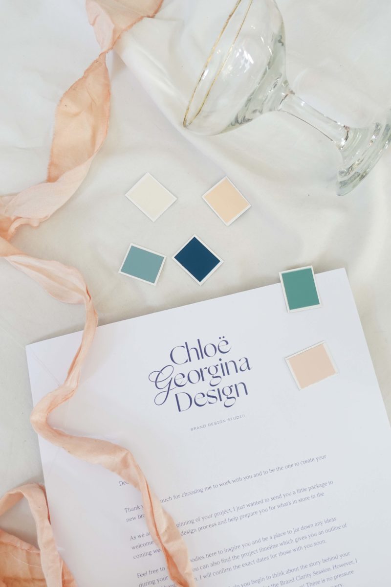

Choosing intentional colours
What I love about my new process I that I allow myself to go into designing a brand with no pre-conceived ideas. I go in completely open-minded, letting feeling and intuition lead the way.
Colour can be such a personal choice, everyone has a favourite and they also know what colours they don’t like. Maybe a particular colour reminds you of a favourite outfit your love to wear? Or maybe there’s a certain colour that takes you straight back to your childhood bedroom. Colour without a doubt evoke memories and emotion.
What is even more interesting is that there is universal psychology to colours, that connects us strongly with the seasons and how we experience them. Colour psychology is a fascinating subject that I encourage you to investigate if you work in the creative industries.
With all this in mind, I knew I had to detach myself from colours and let colour psychology and feeling lead the way. Therefore I had no idea what my brand colours were going to be until I went through this whole new process.

Luckily I was pleasantly surprised by the final colour palette that become part of the rebrand. I was aware that it definitely felt feminine, with the beigy-pinks but they were nicely balanced out with the blues and greens.
The palette is supportive and sensitive, whilst also being timeless and creative. The softness of the palette brings compassion and hopeful optimism. It’s a summer palette that reflects the considered and timeless feel of Chloë Georgina Design.

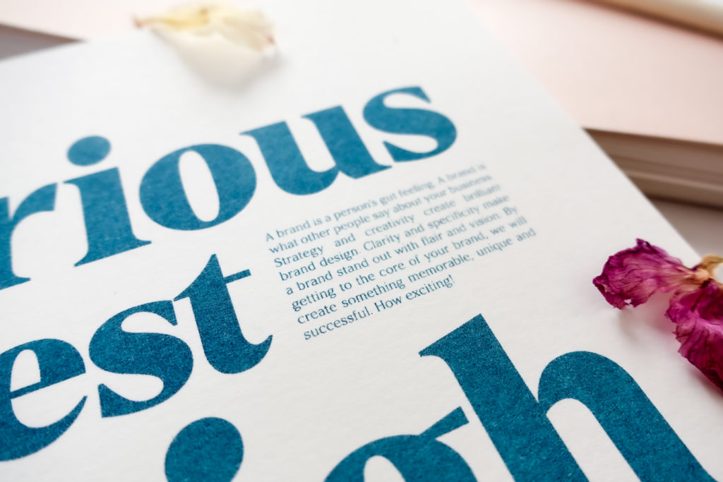
Fonts that bring personality
The two fonts I chose to use for my brand were Denton and Argesta. They both complimented each other well, had a timeless style and weren’t intimidating.
Denton as a header font still had a great amount of character but doesn’t overwhelm the reader. I’m a sucker for editorial style fonts and I just loved how this one felt timeless and distinctive. It also didn’t feel too feminine which helped to balance out the rest of the brand.
Both fonts came with a variety of weights to play with which gave them great versatility for different situations.
As always as I was picking fonts I was always referring back to my three words and my moodboards which made the process smooth and efficient.
Final thoughts…
This is just a small insight into how my new process has been upgraded and what kind of impact it has had on my brand design. My new process stretches out to all aspects of running my business, from on-boarding clients to how I choose to work.
I’m so pleased with how my new branding has turned out, even though it was tough and might have taken a bit more reflection time than usual.
The hardest part was definitely at the beginning when I was getting clear with what I wanted my brand and business to be. But now I hope that its authentic character comes across.

My branding is now in the process of being implemented across my business. With one of those being my brand new media kit! My media kit explains simply how I can help you with your branding and a bit about my style of working.
Email me at chloe@chloegeorgina.co.uk if you’d like to see it
Or in the meantime, I encourage you to download my free Brand Clarity Questions PDF Guide. This guide will help you to create a solid foundation for your dream brand. It will help you to create a brand that is unique, focused, has longevity and capture the true essence of your business. Click the button below to grab your free copy now.


Be the first to comment