I couldn’t have asked a more perfect pair of business owners to work with and implement Chloë Georgina Design’s new Full Branding process.
Fran and Gav at Butter & Sugar had been visualising their brand for a long time. Together they had built up years of experience, collecting and appreciating a wide range of arts and crafts products. Refining their style and getting focused on who and what they wanted to celebrate.
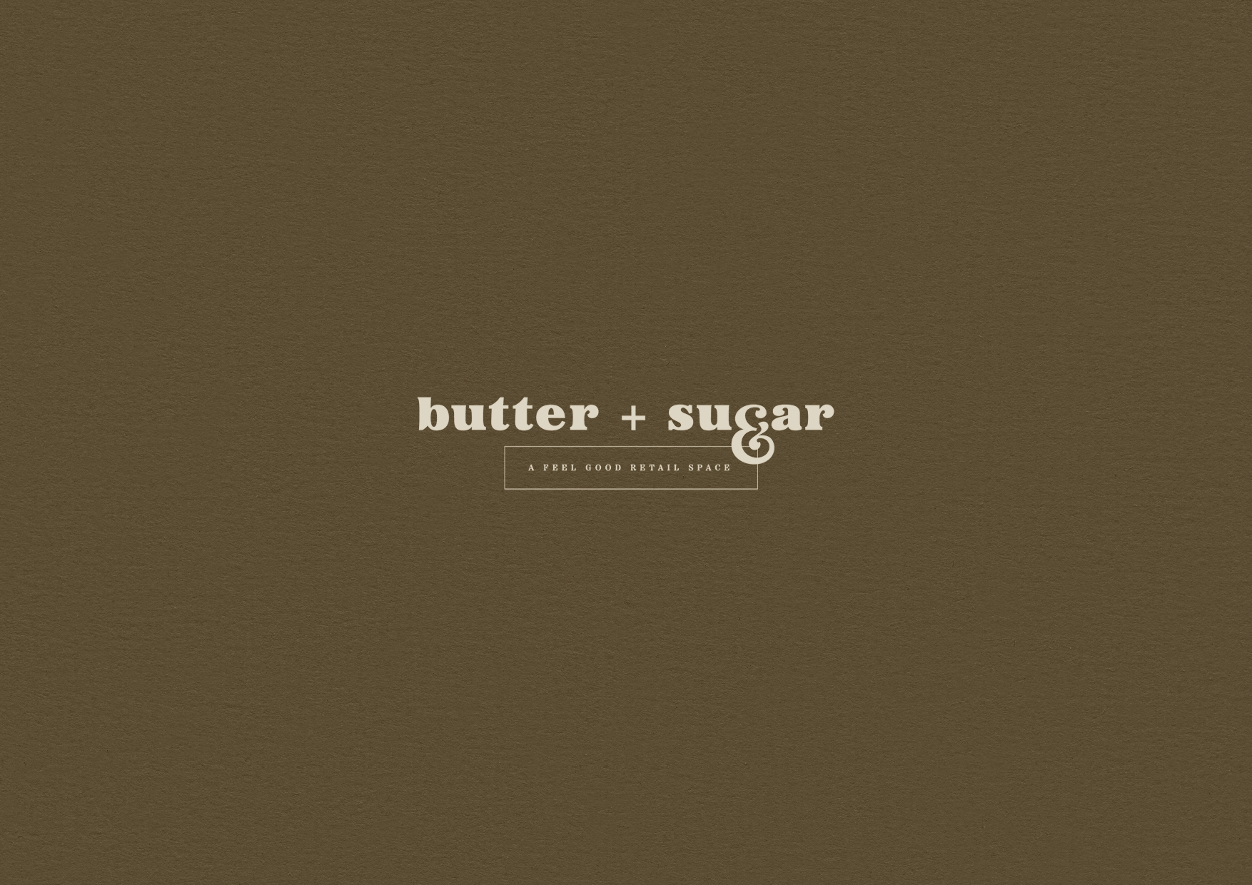
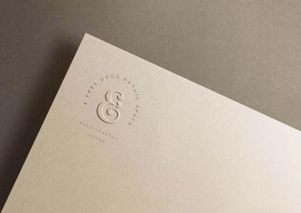
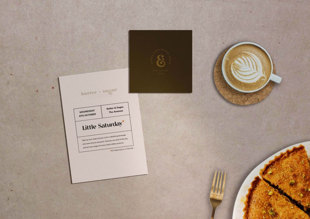
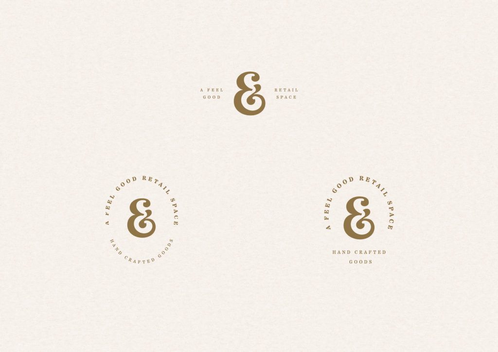
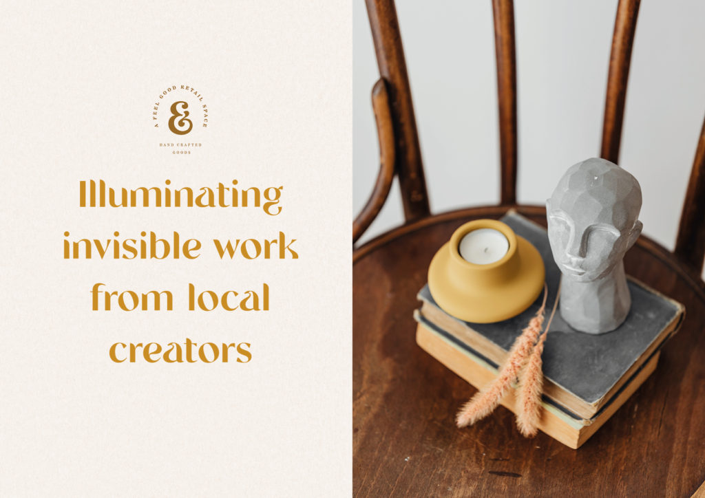
From a mixture of life experience and the desire to engage and help their wider community, Butter & Sugar’s concept is a feel-good retail space that focuses on community over competition by celebrating handcrafted goods from local makers.
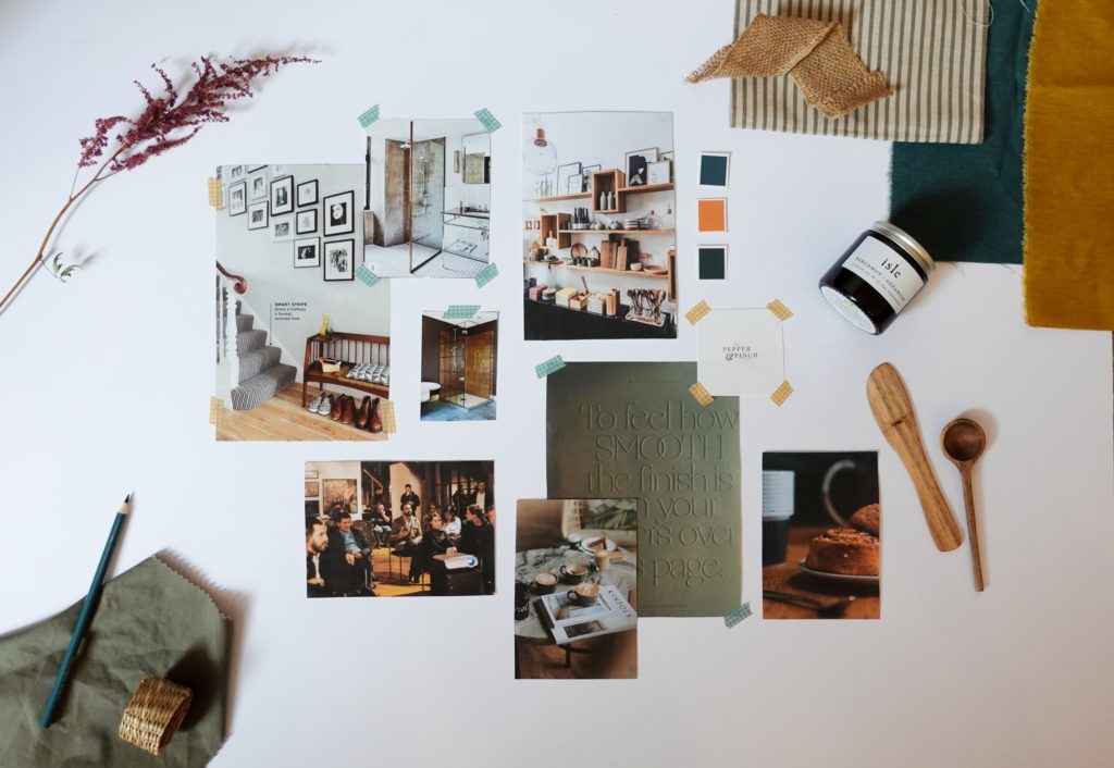
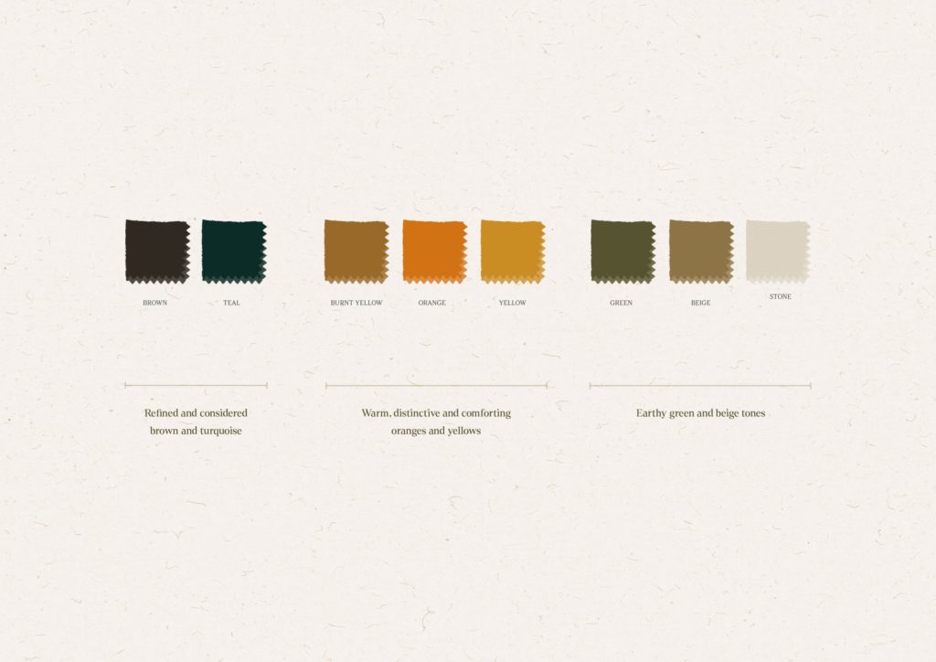
After going through the brand clarity process, together we concluded that the brand should feel grounded, connected and considered. It should be welcoming but not closeting. It should be authentic yet uncommon. Celebrating invisible work. Inspired by Scandi design and traditions of living a slower more considered lifestyle.
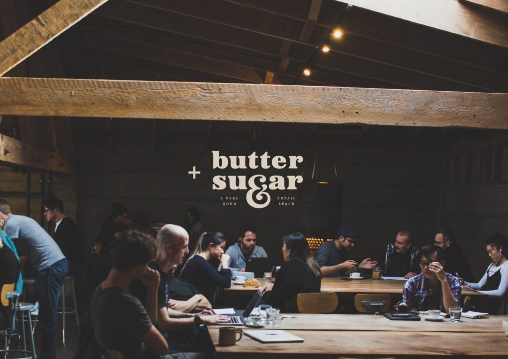
They wanted the retail space to be multi-functional: a welcoming space to shop and invest in locally crafted goods, a place to discover arts, a place to be one’s self and feel welcome and a space to partake in workshops that will bring connection and positive wellbeing.
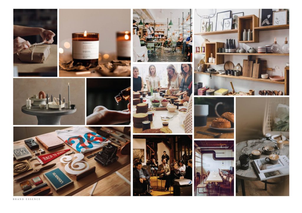
I loved seeing Butter & Sugar’s brand come to life. Chloë Georgina Design’s new brand clarity process created a layered and holistic feel and vision for the brand. It meant we could envisage and feel the world that Butter & Sugar was to be.
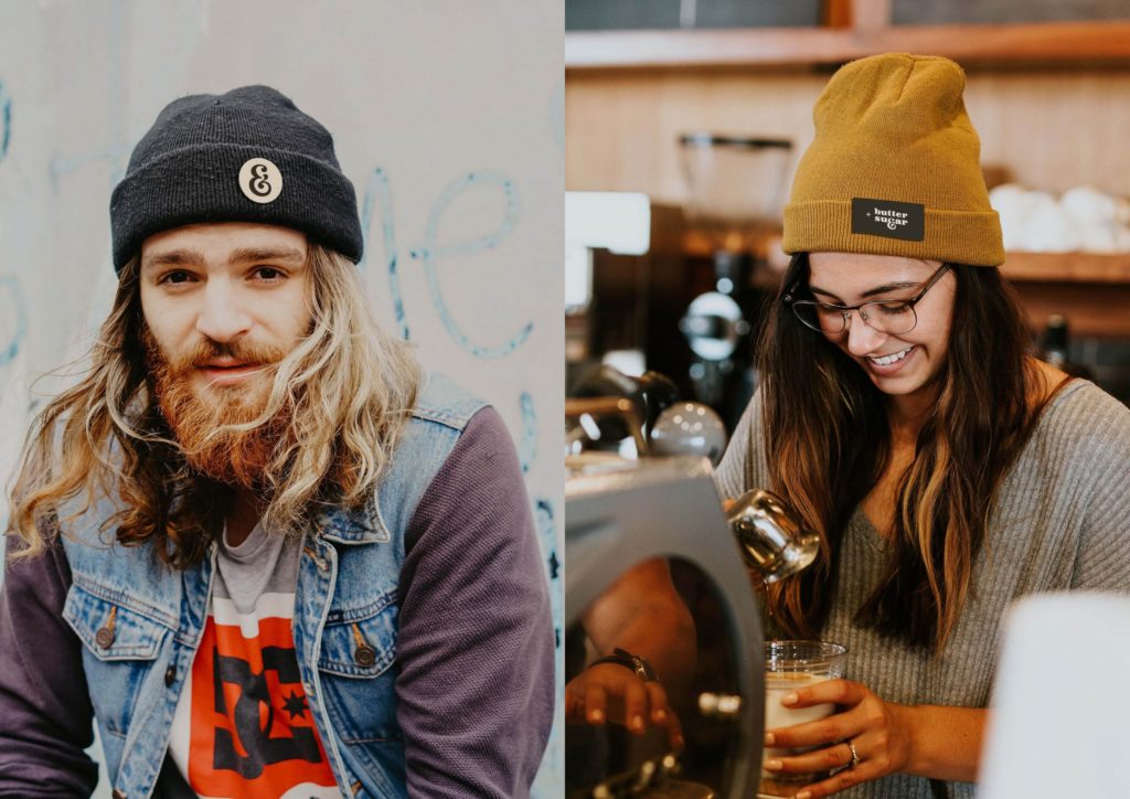
Their uncommon and grounded character comes through in the design choices. Connection was leading the way with this brand, therefore design elements and choices that represent this were vital to the tone of the brand. Approachability with a considered edge connected the brand to their ethos and essence.

Without Chloë Georgina Design’s new full branding process, we wouldn’t have been able to create the layered and sophisticated brand design. By diving deep and focusing on the importance of choosing the right words that describe how we wanted Butter & Sugar to feel. It was a pleasure to work on this brand design and I can’t wait to see the business grow.
You can get first access to any of my projects and work by signing up to my weekly newsletter Notes from the Studio. The newsletter gives you a behind the scenes view of what it’s like to run Chloë Georgina Design and I’ll let you in on any learnings I’ve had or new offerings I’ve created. Click the button below to sign up now. I’d love to have you there!

Be the first to comment